When did you come up with the idea of becoming a graphic designer in motor racing? How did your passion start?
Formula 1 has always been a huge passion and interest of mine. I have been drawing and sketching the cars for as long as I can remember, spending hours just colouring in liveries in front of the TV whilst the races were on. Early on I knew what I wanted to do, expect the tools have changed from crayons to Photoshop!
Designing cars is a rather specific area. How did you develop the skills?
As I mentioned, that’s what I used to do as a kid, and it was from this passion that I wanted to pursue it as a career. Right from my initial stages at school I knew that I wanted to become a car designer, and all my education choices were a direct result of this, leading to studying automotive design at Coventry University, and eventually gaining a full time job as an automotive designer. In my spare time I went back to sketching and photoshopping F1 cars and the liveries, if anything to keep my Photoshop skills up. A lot of my work and development is self tuition and a desire to keep pushing and learning.
You seem to have mostly developed your designing skills on single-seater cars, Formula 1 being the icing on the cake. Is it a preference of yours? What do you like most about the cars and their shape?
It’s my love of the sport from such a young age that is the reason I focus on F1 and single seater designs. The aesthetics and layouts are unique and the ones that have the most connection to like minded fans, so these are the fantasy designs that I like to do to bring the most engagement.
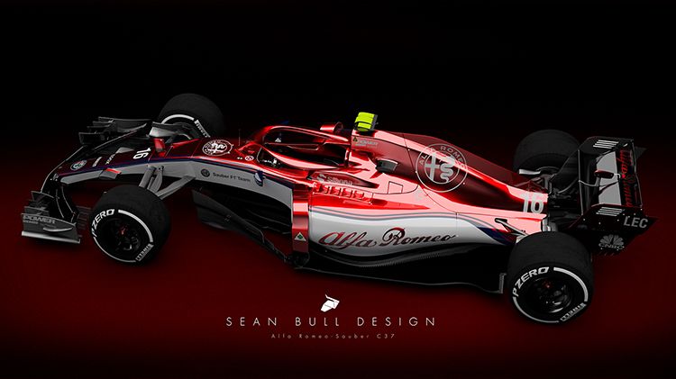
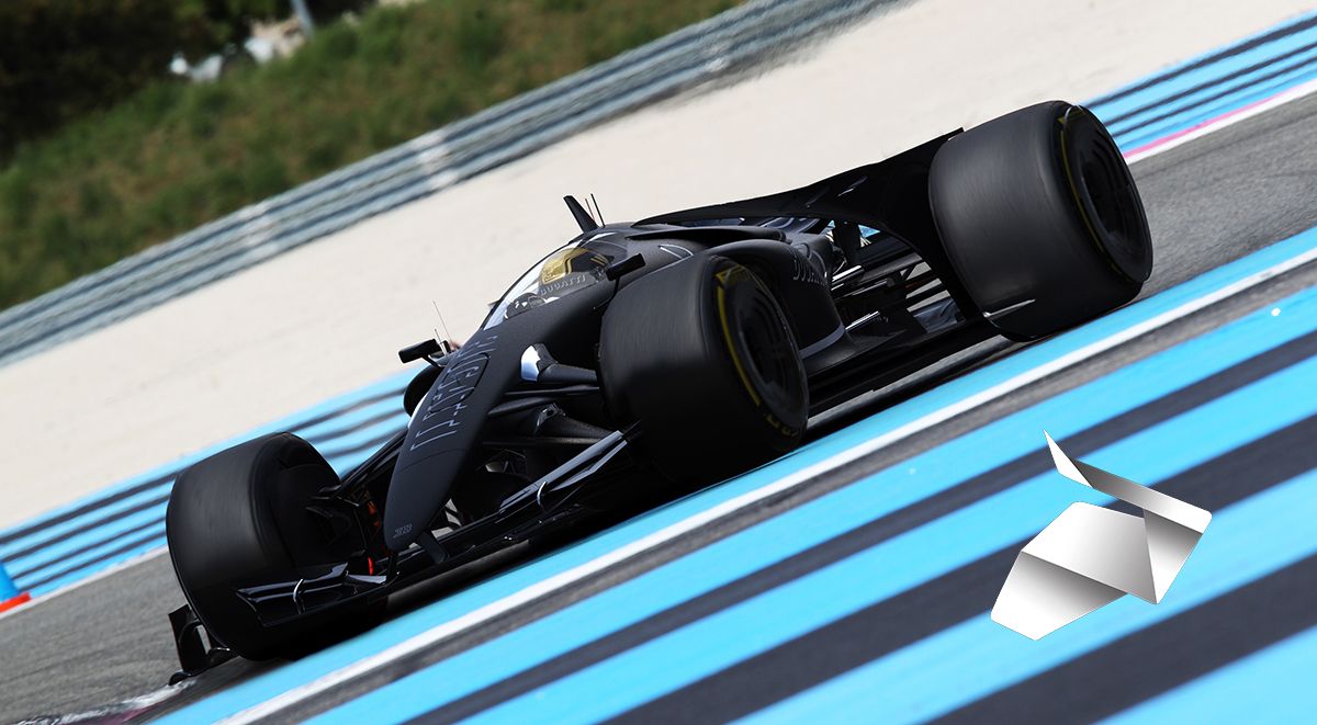
Everyone wants to see certain scenarios that we don’t have or haven’t seen in the real world. I am thinking of brands like Lamborghini, Porsche, Audi,etc… tha could get involved in F1. There are also alternative retro designs from cars of other eras or more radical designs for the existing teams that the real life counterparts. The best part of my fantasy designs is that I am without the real world constraints of the corporations, sponsor restrictions and the like, so I can be as free as I want with the designs! Sometimes this causes negative reactions among fans like ‘that wouldn’t be possible or they would never do that’, but that’s all part of the fun. That is why I use my spare time creating these liveries!
What are the rules to create a good livery? Are there any?
The most important aspect I have learnt from my real world commissions is that usually the car itself gives the livery. You always have to try and go with the lines of the bodywork. If you go against it and try to put too many jarring shapes and patterns that go against the flow of the car’s lines then you usually end up with something quite ugly and ungainly.
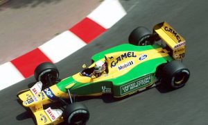
Look at classic liveries such as Martini stripes, JPS and the Gulf Liveries. They are all iconic because they all flow with the shapes of the car, they are simple enough and stick to a core group of a few colours. Anything too complicated instantly becomes a mess on track and on TV.

 '
'

