FLUIDITY
Elegance is a trait shared by all Adrian Newey-designed Formula 1 cars and Red Bull’s latest challenger is no exception to the rule. Less surprising than the Ferrari SF70H, less complex than the Mercedes W08, the RB13 springs forth as the embodiment of sleekness and fluidity. Compared to McLaren’s elaborate volumes, Daniel Ricciardo and Max Verstappen’s 2017-spec car almost looks minimalist.
Although the RB13 is bound to receive developments as the season unfolds, its creator favoured having a neat package to begin with in order to validate the soundness of the car’s overall concept.
“We will see some new parts coming on,” Newey told the official Formula 1 website. “But first we wanted to keep it clean and simple so we understand what we have.
“Maybe Mercedes has reached a higher level of maturity, but I like to start with a simple and clean car - and then you can start adding to it. If you start on a highly complicated level it is so easy to get lost.”
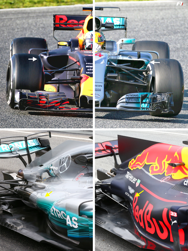
The RB13 emerges as an incredibly tight and compact chassis. Tiny air inlets come with undercut sidepods that are much tighter than on the Mercedes (compare white arrows).
The sidepods tighten as they stretch backward and end up blending into the engine cover (yellow arrows). The split between the sidepods and engine cover has been replaced by what looks like a dome that only widens to vent out hot air

 '
'